A collection of data analysis/visualisations I’ve found inspiring.
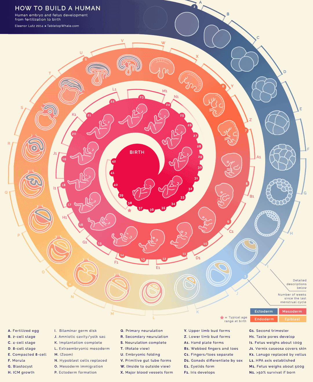
How To Build A Human
By Eleanor Lutz

Source image can be found here.
Battling Infectious Diseases
Visualisation of the number of people in the US infected with measles over time, overlaid with the point at which the vaccine was introduced:

Source image from the Wall Street Journal can be found here.
Is It Better To Rent Or Buy?

Source image from the New York Times can be found here.
Instance Chart

Source can be found here.
Waffle Chart

Source image can be found here.
Ingredients Of Me

Source image from BBC Earth can be found here.
Sunburst Chart

Source can be found here.
Nested Proportion Chart

Source can be found here.
What’s Your Pay Gap?

Source image from the Wall Street Journal can be found here.
Which Authors Have You Read And Liked?

Source image from Tableau Gallery can be found here.
Britain’s Diet In Data

Source image can be found here.
Daily Routines Of Famous Creatives

Source image can be found here.
Rio Olympics Results

Source image can be found here.
How Far Is Europe Swinging To The Right?

Source image can be found here.
Visualising The Gender Development Index

Source image can be found here.
Chord Diagram Storytelling


Source is here.
Scatter Plot Bubble Chart

Source is here.
Data Scientist Venn Diagram
OK, so this one isn’t as beautiful as the examples above but it’s useful, simple and easy to understand, and it’s about data science.

Source image can be found here.
Unit Chart With Icon Images
![]()
Source image can be found here.
